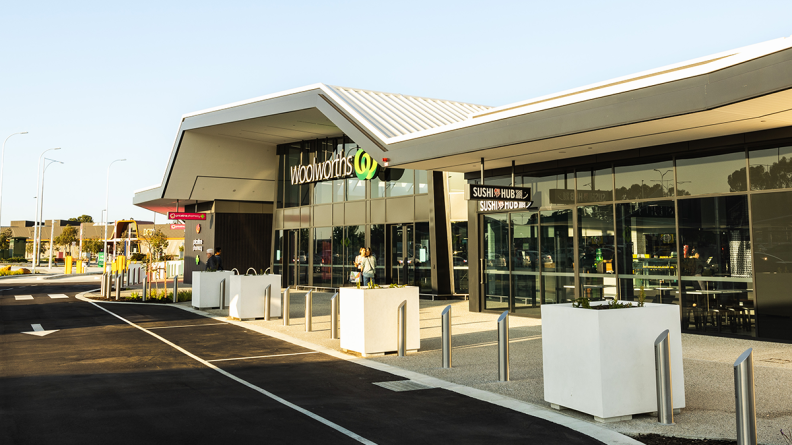
Convenience, accessibility and simplicity are at the heart of Hames Sharley’s design for the recently completed Dunreath Village, which provides thoughtfully planned amenity for locals, travellers and the broader Perth Airport community.
Situated within the expanding Airport West precinct, the newly opened centre hosts anchor tenant Woolworths, operating from 7am to 9pm on weekdays and until 7pm on weekends. Priceline Pharmacy and Sushi Hub round out the current offering, while a café and various pop-up vendors are poised to open later this year.
Dunreath Village forms a community hub within the growing suburb of Redcliffe, catering to residents and commuters using the Metronet train service, and complementing the existing large-scale offerings of DFO and Costco on Dunreath Avenue.
Hames Sharley deftly responded to the community’s need for flexibility, not only in terms of when to shop, but also how to shop. The design, which facilitates Woolworths’ drive-through ‘Direct to Boot’ service and the centre’s convenient two-hour free parking, will adapt and respond to the community’s evolving needs over time, such as future pedestrian connections and an active public interface with the DFO.

Hames Sharley Project Leader Martin Bradbury said that the project’s success was testament to the strong collaborative relationship between client, builder and design team.
“The original design concept is manifest in the built form, thanks to the efforts of all involved throughout the design and build process,” he said.
The design language draws reference from the Perth Airport precinct, with the main design feature being a folding, paper plane-like exterior canopy. It floats above the main public realm across the shopfronts, acting as a beacon from afar, while also providing cover and amenity up close.
Considered winglets at ends of spans provide points of branding and visual interest at the edges. From there the canopy dances over the specialty shopfront elevations towards the central lobby space where the folded planes turn down with an origami-like approach creating a striking, faceted three-dimensional glazed façade and bold customer entry statement.
Lighting design takes similar cues to help embolden the aesthetic. The result is a design approach that is both familiar and convenient to all, while creating something fun and unique.